- Where to monitor survey completion rate
- How to set the graph according to your preferences
- How to monitor survey completion rate
Where to Monitor Survey Completion Rate
1. Navigate to Circles and select the required one from the list
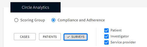
2. In the Circle Analytics field, select Compliance and Adherence → SURVEYS
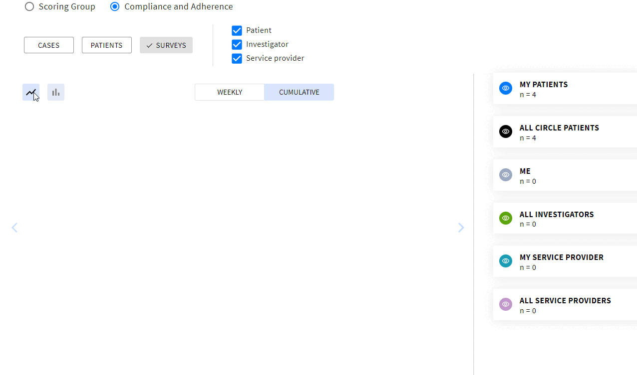
Graph Settings
Set the graph according to your preferences:
Assignees / Cohorts
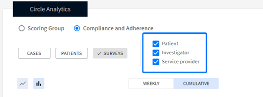
Check the boxes to filter the surveys by the desired assignee:
- Patient
- Investigator
- Service Provider
- While filtering, the survey’s main assignee is taken into account.
- Surveys assigned to patients always calculated into patients' surveys completed regardless of who actually completed it.
Each type of the assignee has two corresponding cohorts on the graph:
- Only your data
- All Circle data
- Switching off one of the assignees will switch off both - All /My - corresponding cohorts on the graph (e.g., switching off “Patient” will hide All Circle Patients and My Patients on the graph)
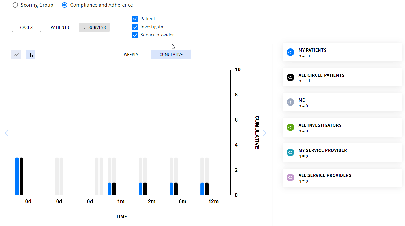
Each cohort has its color to easily identify the required type of data on the graph:
To switch off/on the required column on the graph, click the corresponding eye icon on the right of the graph.
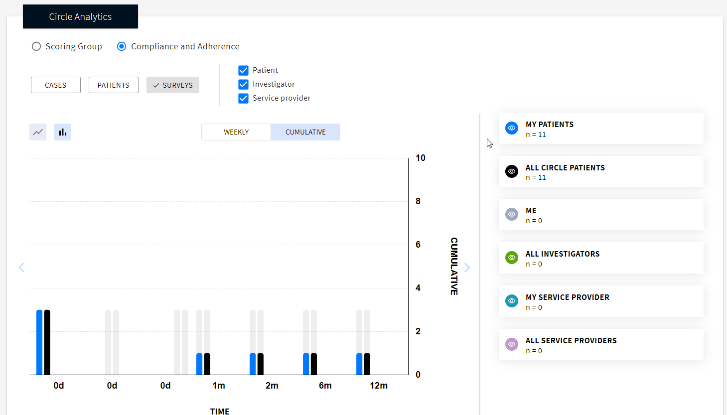
Graph View
At the top of the graph you can select:
- The preferred graph view: line graph or bar chart

Statistics Included
Data included into the statistics:
- All surveys from the active cases created for the selected Circle as Primary Circle
- Surveys which are currently not in use but contain data
Data excluded from the statistics:
- Archived cases
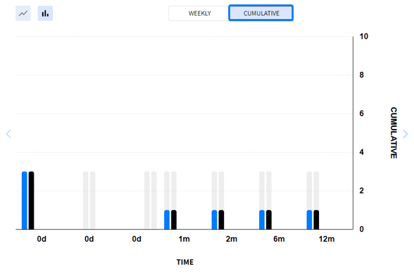
Depending on the required amount of data you’d like to see on the graph, select between weekly or cumulative view.
WEEKLY - displays data in a one-week periods. This option is helpful for keeping track of the ongoing activity.Data included:
-
- Actual: due, overdue surveys with a due date falling within the specified week, and completed within that same week
- Expected: surveys expected to be completed within the given week according to the due date
In a Weekly data presentation, the statistics is shown ONLY for the current week. Overdue and not completed surveys from the previous periods or upcoming surveys are not included into the statistics.
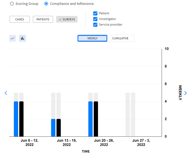
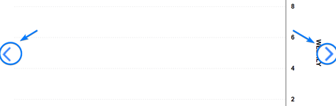
Use arrows on the right and left of the graph to switch the weeks back and forth.
CUMULATIVE - displays all data for the whole time based on the survey scheduling in the protocol. Useful for having the general picture of Circle activity.
-
- Actual: number of cases where survey is completed
- Expected: number of cases where survey is due or overdue. Upcoming surveys are not included
When the graph is all set, you can get down to analyzing it.
Monitoring Survey Completion Rate
ACTUAL VS EXPECTED
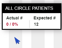
To view the actual and expected number of completed surveys, simply place your cursor over the desired column.
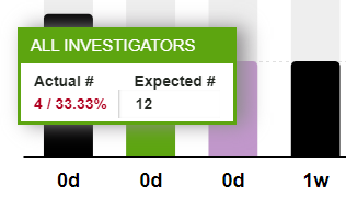
Actual surveys: the total number of surveys completed during the specified period that were either due or overdue + the compliance rate compared to the expected number.
Expected surveys: the sum of all due or overdue surveys which are planned to be completed for the given period.
For example, looking at the image, we can see that 4 surveys have been completed, while the expected number of surveys to be completed is 12, resulting in a completion rate of 33.33%.
The numbers in actual cases are displayed in different colors:
Gray color of the column means there are no surveys completed for this period yet.