You can analyze data gathered from patients within the Circle to use it in your practice or investigations.
To do so,
1. Navigate to Circles and select the required one from the list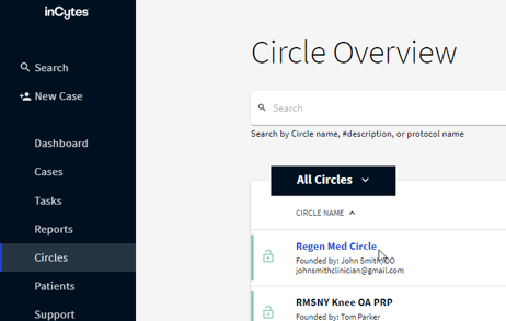
Once landed on the Circle Details page, in the Circle Analytics field you’ll see all the scoring groups used in your Protocol version.
2. Choose the scoring group you’d like to display on the graph 
You can switch between line and bar chart view at the top left of the graph

To be included into the chart, the survey with the selected scoring group must be completed at least once.
Cases where answers to scoring groups were not given, are not included into statistics.
You can switch off/on the required column on the graph by clicking the corresponding eye icon on the right of the graph.
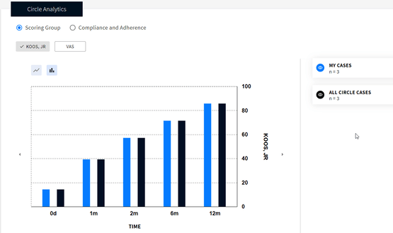
For members with no access to all Circle data the cohort All Circle Cases is not displayed. Contact your Circle administrator for more details.
3. Hover your mouse over the desired column on the bar chart or datapoint on the line chart to see the detailed info for this period:
- Average score for this period
- The number of patients completed this survey

