You can add and compare no more than 4 cohorts on one graph. Each cohort marked its color and has a corresponding line of the same color on the graph. inCytes uses 4 colors for cohorts:
- blue (My Patients by default)
- black (All Circle Patients by default)
- green
- grey
So, if you delete a cohort or switch it off, the line with the same color disappears from the graph.
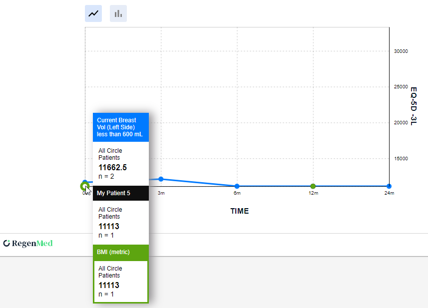
Hover your mouse over a dot on the required line on the graph and there will appear the pop-up with the following info:
- Cohort name
- The info on whether the cohort refers to all Circle patients or only your patients
- The result for the particular time period (you can find the time on the X-axis)
- The number of cases where the survey was completed for the given period and its data meet the cohort criteria
Information is displayed for all the cohorts which have results for this time period.